 YouCan Developer
Alto Beta Release: Our Newly Refined UI Library
Introducing Alto
We're excited to introduce Alto, YouCan’s official design system and newly refined UI library. Designed to bring consistency and coherence across all platforms and products, Alto prioritizes DX by offering a set of upgraded and new components tailored for efficiency and enhanced usability.
Key Features and Updates
- Cleaner code for better usability
- Ongoing updates and improvements
- Comprehensive documentation
- RTL supported
- Responsive design
What's new in Alto?
Built on the foundation of YouCan UI -our legacy library- Alto focuses on improving usability, adding functionalities and components, and refining the developer experience.
Usage Update
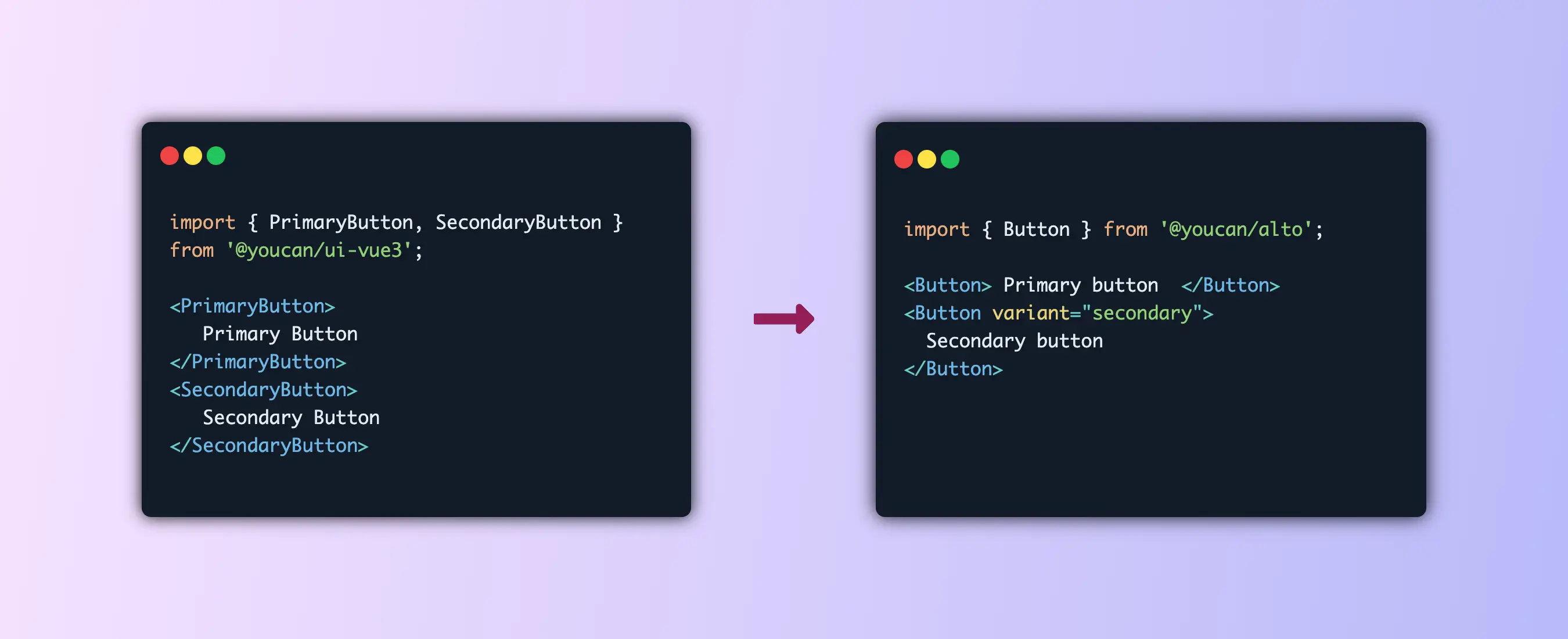
The unnecessary complexity of using app.use in the index file has been removed. Instead, you just import components directly in the project file, making the process more efficient and developer-friendly.
Size Optimization
The new library offers enhanced performance, with Alto being significantly more lightweight than the legacy version.
| Alto | YouCan UI |
|---|---|
| 379KB minified (108KB gzip) | 408KB minified (117KB gzip) |
Major updates in Components
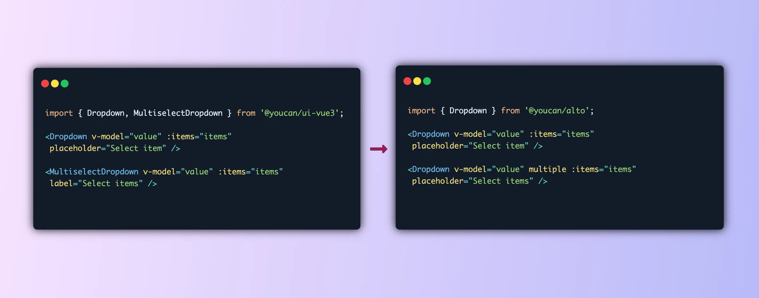
Dropdown
- Simplified by removing
sizeprop. - Removed separate components related to dropdown, including :
<MultiSelectDropdown /><DropdownPrefix />
- integrated
multi-selectfunctionality by including amultipleprop within the<Dropdown />component. - Introduced item grouping and implemented arrow navigation.
- Renamed the function
searchHandlertosearch.
Loader (FKA Spinner)
- New component with multiple variants
- Spinner (This was a separate component. It is now included as a variant)
- Brand
- Bar
 | 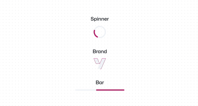 |
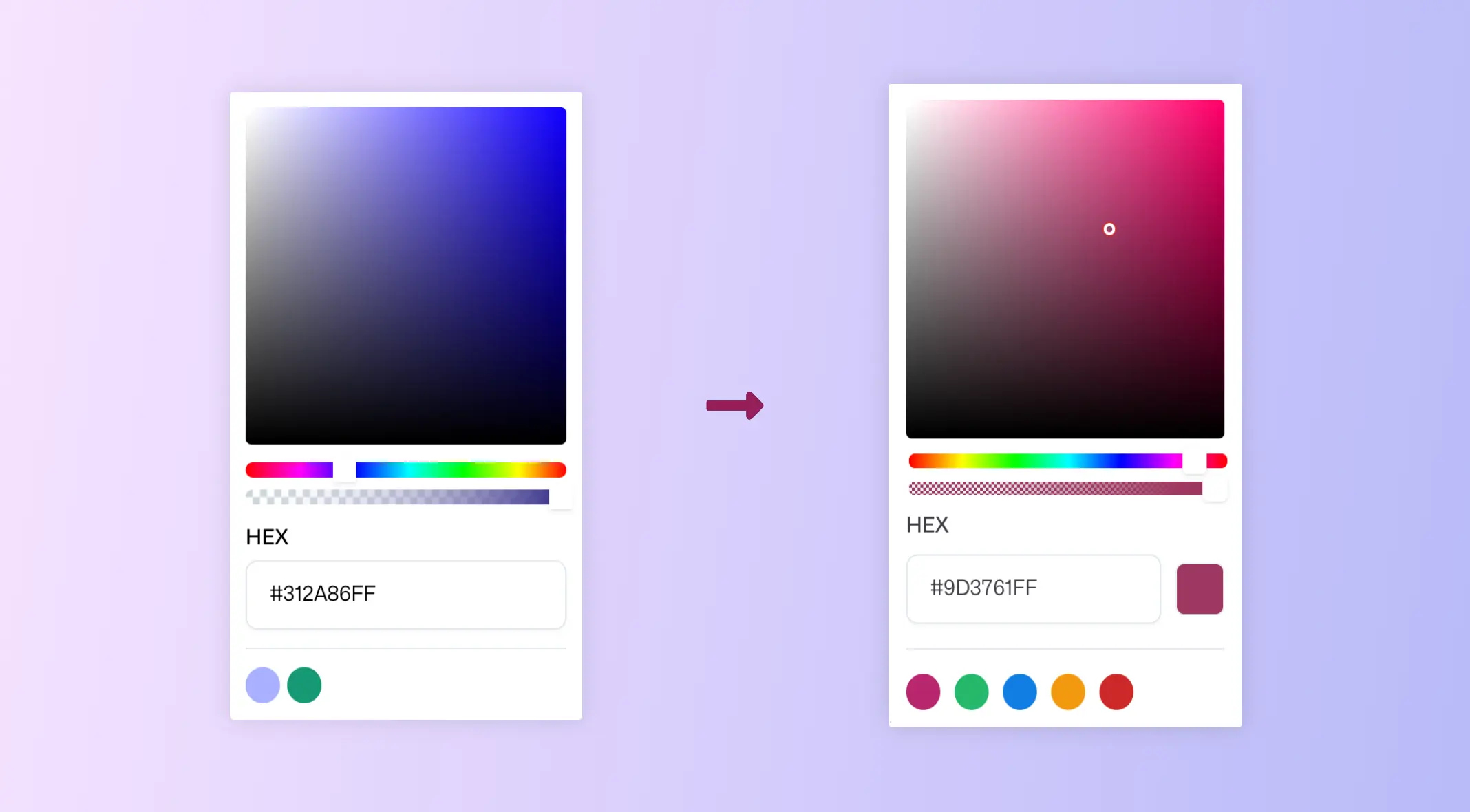
Color
- Enhanced UX for selecting a color with an improved color picker functionality.
- Added possibility to directly edit the color input field.
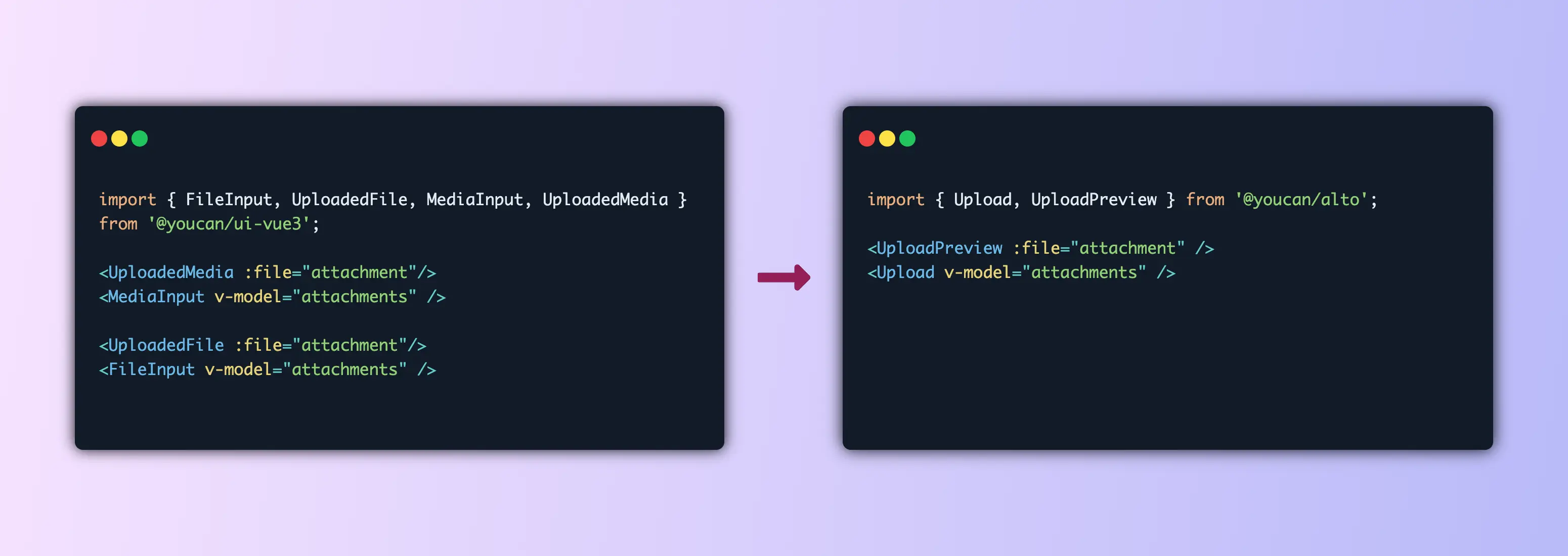
Upload
- Combined file input and media handling into one unified component.
- Added file preview and deletion within the component.
- Integrated all upload functionalities into the
Uploadcomponent. - Centralized preview features in the
UploadPreviewcomponent. - Added error state to the image preview.
- Added
acceptprop to specify accepted file type.
Button
- Unified multiple button types into a single component that accepts a
variantprop for different styles. - Eliminated duplication of CSS variables by directly using tokens.
- Switched from SCSS to CSS to simplify updates.
- Enabled button components to support
hrefprop, allowing them to function as links.
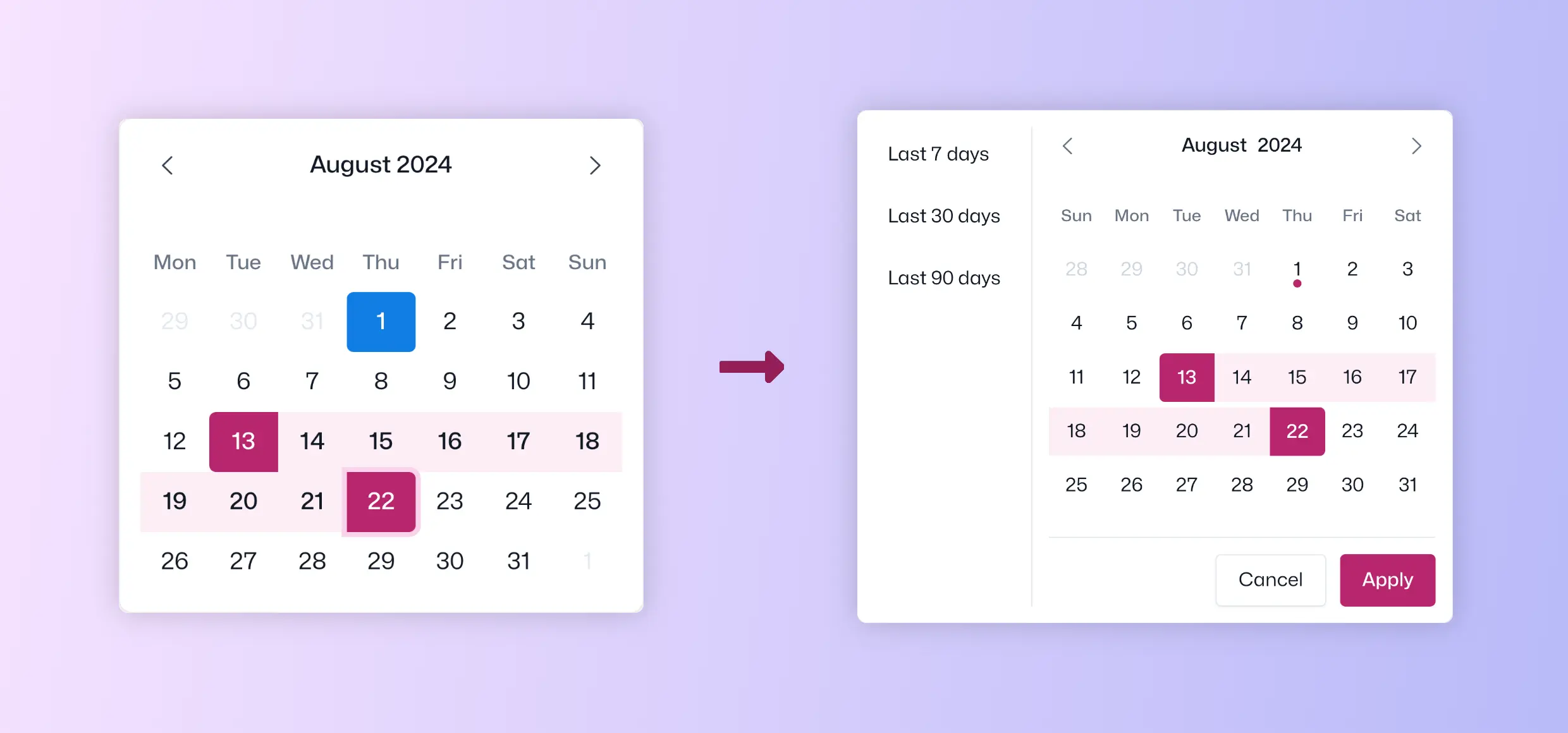
Date Picker
- Merged
SingleDatePickerandDatePickerinto one component. - Simplified date selection and improved the design for better user experience.
- Added
presetsfor quick selection. - Added
MinandMaxDates to limit the selectable range. - Added
applyandcancelbuttons for more control on date selection actions.
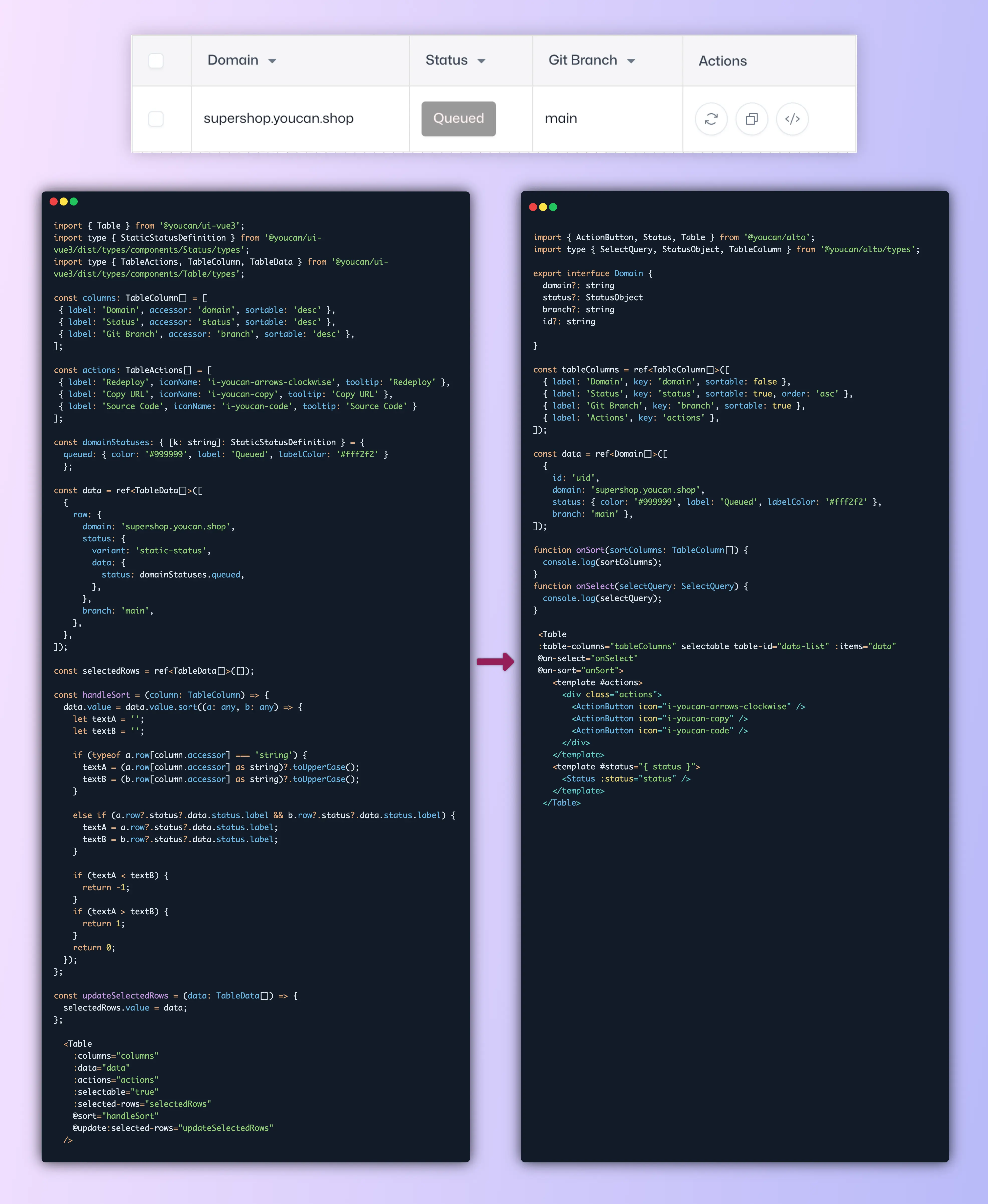
Table
- Added the option to customize cells by adding a slot with the column key as the name.
- Simplified the
DataRowtype to reduce complexity. - Removed unnecessary component imports like tooltips and buttons.
Minor Updates in Components
Rating
- Made display mode the default for the
Ratingcomponent, with aneditableprop added to enable rating input. - Modified the component to set the rating to the max number of stars instead of throwing an error if the input exceeds this value.
- Renamed
ceiltostarsandscoretorating.
Status
- Unified functionalities into one component.
- Automatically becomes editable if an array of values is passed.
- Adjusted content width.
Additional Components
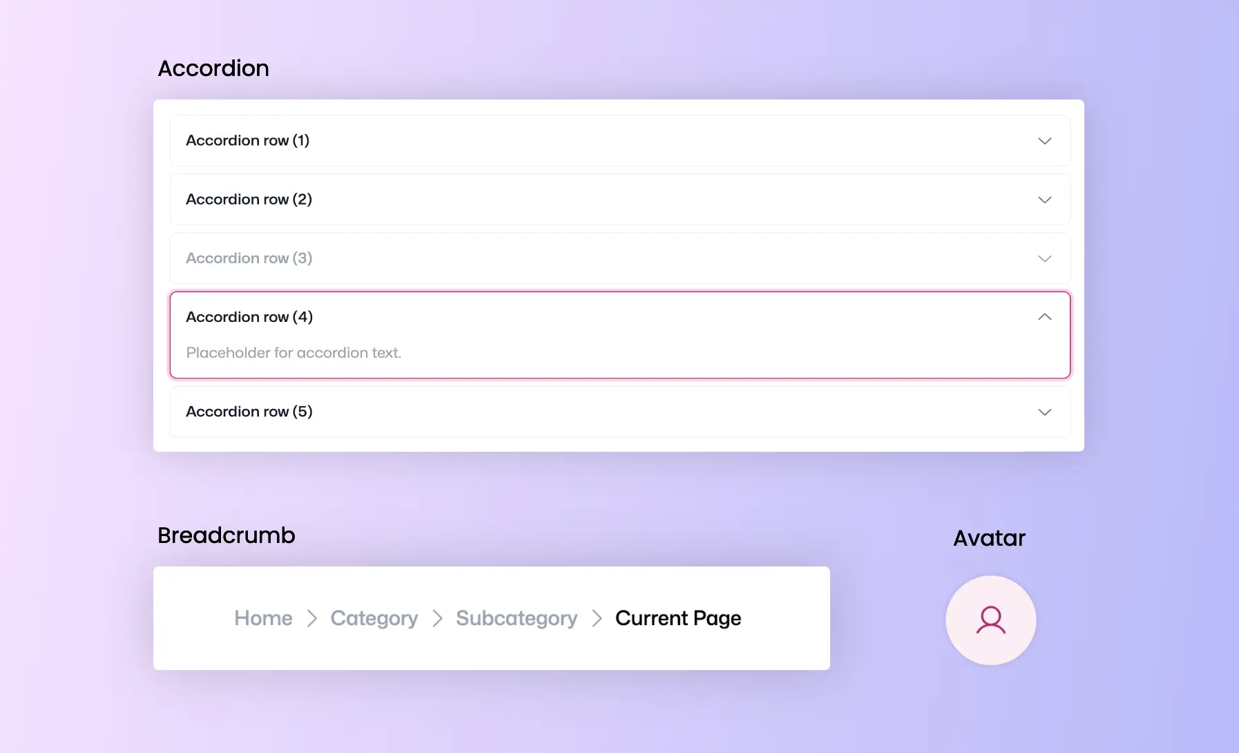
We have introduced new components to the library, including Accordion, Breadcrumb, and Avatar, with more to come.
In addition to the major overhauls mentioned earlier, several existing components have been updated to simplify code and reduce complexities.
How You Can Contribute in this Beta Version
As this is a beta release, we are in the process of enhancing Alto's features based on real-world use and feedback. Developers are encouraged to integrate these components into their projects, identifying any issues or potential improvements.
Your contributions are crucial for the final adjustments. Create an issue or submit a feature request via this link.
For further details, you can also check the related documentation.